
Tuesday 20 May 2014
Wednesday 15 January 2014

Thursday 9 January 2014
Euro Tour 2012
Euro Tour 2012 by Fong Ong from Fong Ong on Vimeo.
My Europe holiday video finally collaborated into one from 2012 after my high school graduation!
Tuesday 7 January 2014

Monday 6 January 2014
Suck It Up.
 Some personal typography work, simply using a sharpie and micron pens. From hand drawn to digitalised on illustrator.
Tuesday 27 August 2013
Monday 29 July 2013
They Said I Could Be Anything..
They Said I Could Be Anything from Fong Ong on Vimeo.
My first stop motion video
A "Get Up & Go" assignment for Advanced Media & Integration class.
Wednesday 5 June 2013

Not Kiddin' Organisation


Ideas to Design Research
Mission Statement: ‘Not Kiddin’ is an Australian organisation that looks upon the rituals and ceremonies of young adults (between the ages of 18-21), who will face their journey into adulthood. It explores a young adult’s first encounter with adult situations such as voting, relationships, finance and legal rights. This gives our target market an insight of challenges they may face, allowing them to be prepared when transitioning into this new stage of their life.
Hideaway (Redesign of Duck Creek)


Design Research & Ideas Generation
Group project featuring: Mandelyn Lee, Yvonne Chu, Derek Liu & Sandy Setiawan
A 24 page magazine with redesigns of Duck Creek, South Granville. Primary and Secondary research were conducted such as interviews, archives and websites. This allowed us to gather enough information to have an ideal perspective and reasoning as to why we wanted to improve the space.
Sunday 2 June 2013
Heinz Shock Locks

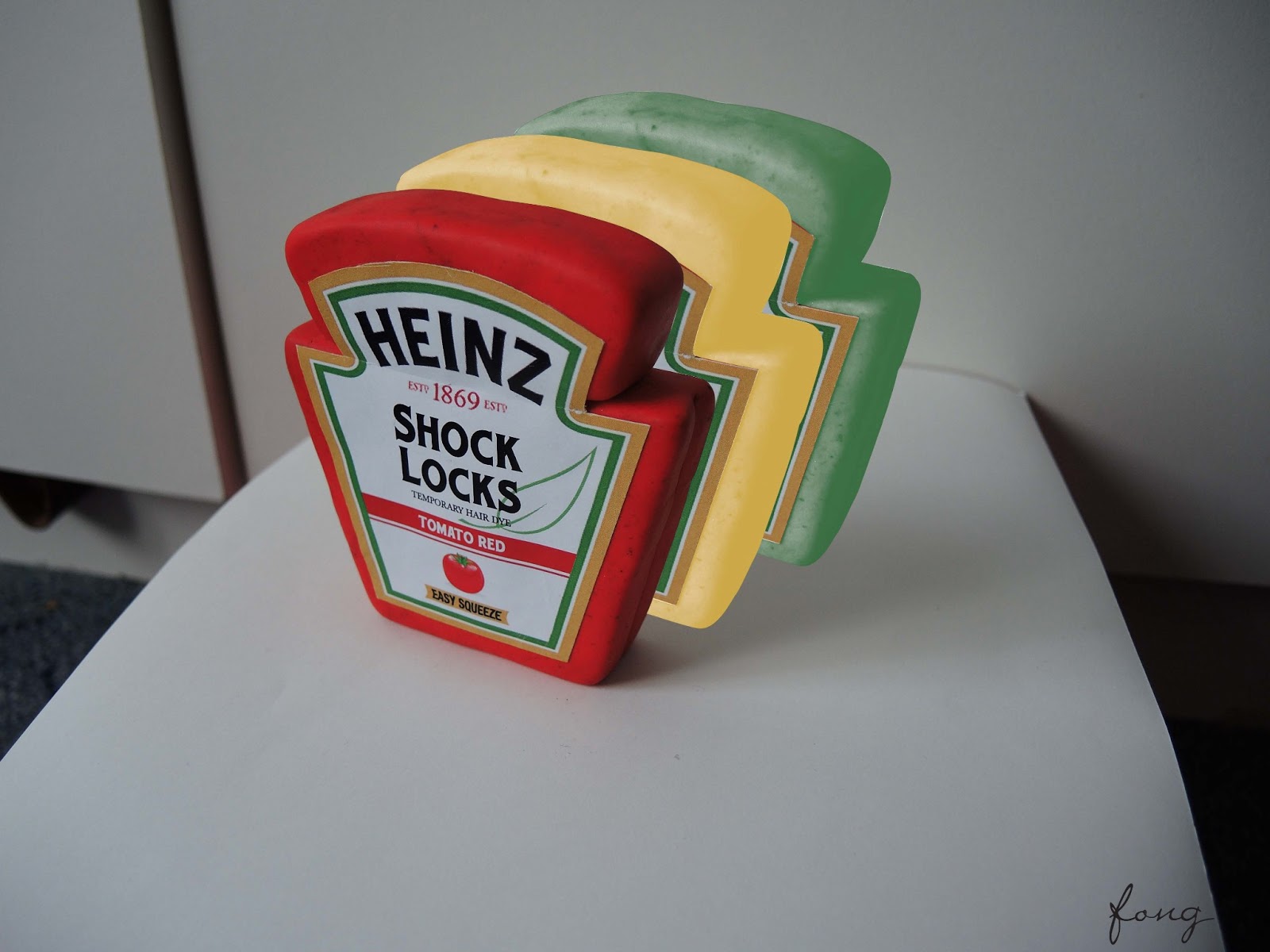


Rebranding Heinz by giving it a new product. Instead of the typical tomato sauce and baked beans Heinz introduces Shock Locks, Heinz Temporary Hair Dye. It is 100% organic and uses the vegetable extract labelled. Such as red dye colourants = tomato extract
Tuesday 16 April 2013

Wednesday 13 March 2013

Thursday 4 October 2012

Friday 10 August 2012
The Innocence Project
Working in this group has been the best experience of my college life so far. Being in such a fun and close group we were all able to connect so well by have celebratory drinks after every success!
Wednesday 1 August 2012
Personal Branding Portfolio


Frameworks of Design
The task was to produce a design company with a logo, folder, website, business card, letterhead, gift, cd case and follower.
Monday 30 July 2012
Face Logo

Typography & Context
Wordmark, Letterform, Abstract
This is a publishing logo which we were required to incorporate the word ‘Face’ into. We were also required to develop a wordmark, letterform and abstract version of the logo. Originally, I struggled to come up with a creative name, however I wounded up using ‘Face to Face’ and I am pretty pleased with the results.
Saturday 28 July 2012
Infograph About Myself

Frameworks of Design
Developing an infograph about myself.
I felt very intimidated by this task from the examples the lecturers had shown from last semester. I was very worried that mine did not meet their expectation, however I ended up with a great mark and could not be happier.
Thursday 19 July 2012
Redesigning an Existing Space


Introduction to Design Practice
Required to redesign an existing space of our choice. Chosen a deserted and unknown area at Billy Blue College and had rendered the photo to our expectations on Photoshop.
This was the first time I had ever used Photoshop and I am incredibly proud of my first attempt.
Friday 29 June 2012
Producing a Consumer Brand and Product (Snow Wine)

Introduction to Design Practice
Group project featuring Lee Porter, Meaghan Barone and Emma O'Connell
This was a group assignment, where we were required to produce a consumer brand an product. We had chosen a white wine incorporating the theme of Snow White. This was to target young female drinkers as we felt there was not enough variety for us.
Monday 4 June 2012
Themed Biography of Vivienne Westwood


Design Culture & Theory
This A5 horizontal book required a consistent theme of the designer. Such as for this instant Vivienne Westwood’s biography consists of a punk theme throughout.
Thursday 19 April 2012
Introduction Into Design Practice


A Journey Into The Drawing Process
Collection of my drawing pieces and developed into a hardcover book with a sleeve.
This hard cover book was hand made by saddle stitching and binded by a thread. It contains compositions elements of texture, colour and perspective.
Friday 2 March 2012
Spirit Music Festival Poster (Old School Genre)


Hierarchy, minimal colour palette (2 colours maximum), 3 symbols & 2 sponsors
During my design process, I found it extremely difficult to make a choice between the two posters. They are exactly the same however one is more minimal, where as the other is zoomed up creating a more compact appeal. In the end I went with the more minimal option which landed me a HIGH DISTINCTION! *fist pump*
During my design process, I found it extremely difficult to make a choice between the two posters. They are exactly the same however one is more minimal, where as the other is zoomed up creating a more compact appeal. In the end I went with the more minimal option which landed me a HIGH DISTINCTION! *fist pump*
Thursday 24 November 2011
Deceasing Tree (Born To Die)
Deceasing Tree, represents an unstable and fragile figure. Surrounded by many support and love, it still remains standing. This is me, this is me inside.
Yes, I know. Not the most creative name, but my only excuse is that, I was young and naive & that I didn't know better (that seems to be my excuse for everything lately!)
So this was my attempt into Art Express, however I did not succeed but I did end up with an AWESOME mark for this. In fact, I started my Body of Work in November 2010, because I love starting shit way before it's due. I was actually caught out one time.

Subscribe to:
Posts (Atom)